 Krater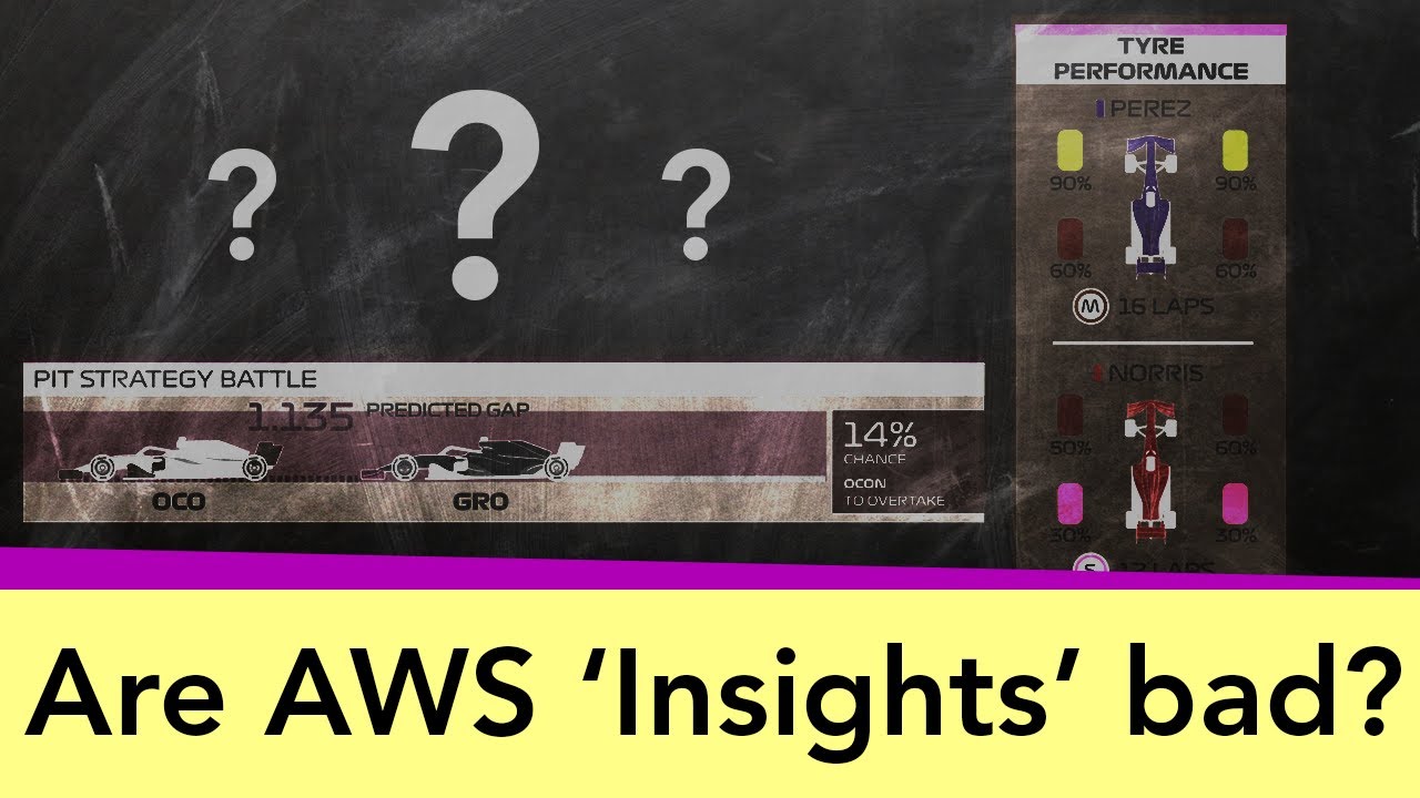
Are F1's new 'insight' graphic ideas actually bad?
A video on YouTube. In Sports, a Krater category.
Watch on YouTubeSummary by Krater
An analysis of Formula 1's graphical insights powered by AWS, examining whether algorithmic data-driven graphics like tyre performance and car performance scores enhance or detract from watching races.
From the video
Answers: Are F1's AWS insights and data graphics actually good for watching races?
- F1 Insights
- AWS in Formula 1
- Tyre performance graphics
- Car performance scores
- Data visualization in motorsport
- Interpreted data vs raw data
What it concludes
- The tire performance graphic was criticized by Pirelli themselves for being misleading.
- Data and graphics can be used well to tell a story or allow viewers to follow several points of interest simultaneously.
- Predictive pit strategy graphics take away the suspense and fun of watching race outcomes unfold live.
- Car performance scores lack transparency regarding their underlying methodology, making numbers hard to interpret.
- Formula 1 should remain neutral on driver rankings rather than publishing official lists of driver skill comparisons.
Rate it, review it and add it to your lists in Krater.
Titles and thumbnails from YouTube. Krater isn't affiliated with, endorsed by or sponsored by YouTube or Google.