 Krater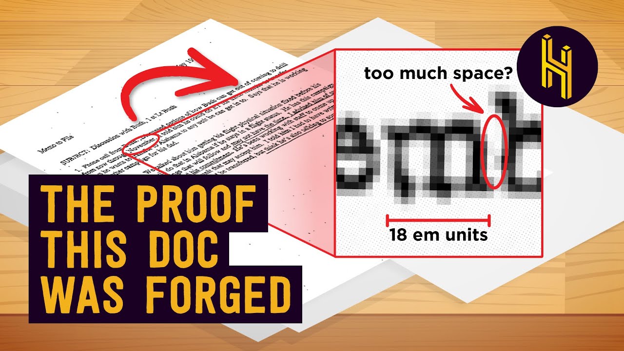
How This Single 'M' Almost Ruined a US Presidency
A video on YouTube. In Explainers, a Krater category.
Watch on YouTubeSummary by Krater
This video examines historical document forgeries and explains how font detectives and typography experts use letterforms, typefaces, and metadata to expose them.
From the video
Answers: How do font detectives catch document forgeries?
- document forgery
- typography and fonts
- font detectives
- Hitler Diaries
- Panama Papers
- Operation Sledgehammer
- Killian Memos
- proportional vs monospaced fonts
- Calibri font history
- Times New Roman font history
What it concludes
- The Gothic letters on the Hitler Diaries spelled a Gothic F rather than an AH because the forger confused Gothic letterforms.
- The Calibri font used in the Panama Papers trust document was not commercially available in 2006 when the document was supposedly signed, exposing it as a fake.
- Documents related to Operation Sledgehammer in Turkey used Calibri font references in their hex code despite being dated 2003, before Calibri existed.
- The Killian Memos regarding George W. Bush used proportional Times New Roman font features, such as proportional M's and character kerning, that were impossible on 1970s typewriters.
Rate it, review it and add it to your lists in Krater.
Titles and thumbnails from YouTube. Krater isn't affiliated with, endorsed by or sponsored by YouTube or Google.